Body text Regular
Atkinson Hyperlegible Regular 16pt
Body text Bold
Atkinson Hyperlegible Bold 16pt
queer stories, on postcards
A project where each postcard shared online offers a little moment of joy and connection, helping queer people feel closer to community even when stepping away from their screens.
Queer people want to learn about others lives and feel connected to the wider community, but busy
everyday lives leave little time or energy for in-person connection or active participation in queer
spaces.
The challenge was to enable meaningful connection without demanding time, performance, or
social presence.
The Queer Postbox is a digital platform where queer people share personal stories through postcards. The postcard format offers a calm, intimate way to connect, allowing users to read and reflect at their own pace. This creates a sense of belonging through quiet visibility and shared experience.
Survey with 25 queer participants
4 in-depth interviews with queer adults of varied genders
96% enjoy sending or receiving postcards, showing a strong emotional engagement with the format
Users
are curious about others personal stories and believe that reading others stories will make them
feel a stronger belonging with the community
Users do not want to comment on postcards in
the regular sense, rather have the comment with another postcard
Queer individuals want to feel a stronger sense of connection and belonging, but busy everyday lives often leave little time or energy to meaningfully engage with others beyond their own surroundings.
To solve the problem statement a How Might We was created:
How might we enable queer people to learn about others lives in a way that fosters belonging?
Emil is a gay man with a busy life. He works full time, spends most of his free time with nearby
friends or recovering at home, and has little energy for activities beyond his immediate
surroundings.
Emil values quiet, personal forms of connection and enjoys sharing
personal stories, remembering the joy of sending and receiving postcards.

Based on the research insights, three design principles guided the direction of the product: Respect the ritual places the postcard at the centre of the experience, honouring its slowness, intention, and emotional weight. Leave feeling lighter focuses on creating a calm, reflective space that users can step away from feeling slightly uplifted. Come closer to the community ensures the experience strengthens a sense of belonging by making other queer lives visible through shared, personal stories.
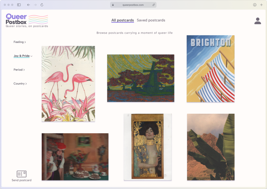
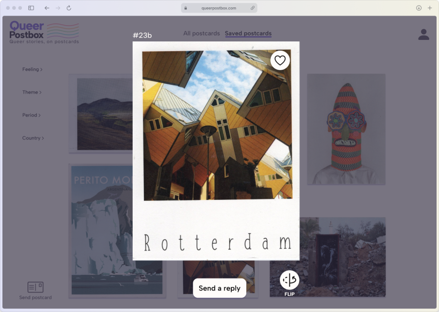
Emil enters
the site
he filters for
"Joy & Pride"
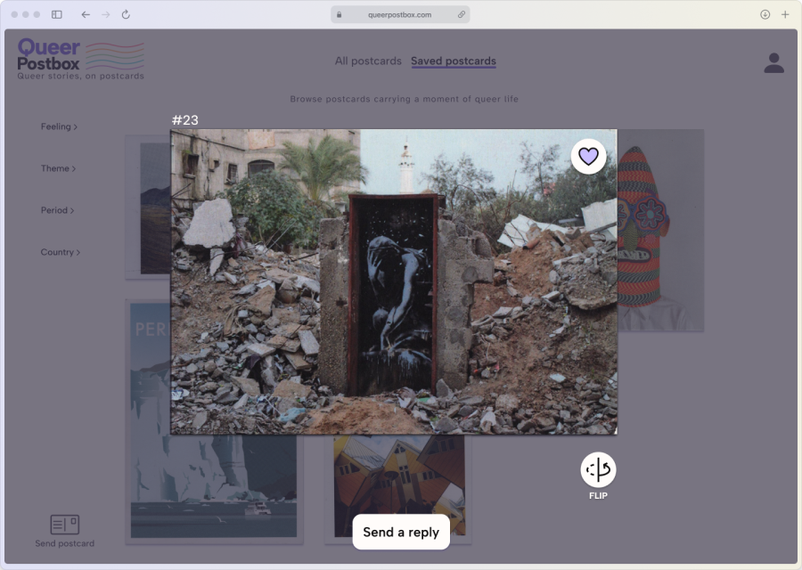
clicked on
a postcard
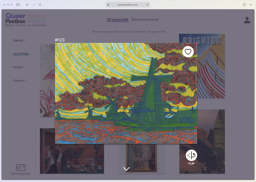
goes for
"FLIP"
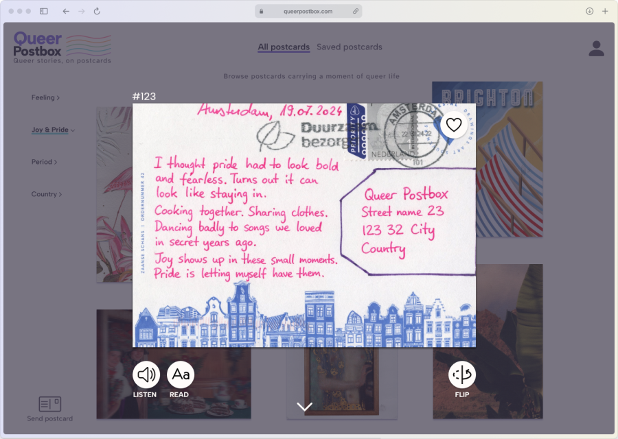
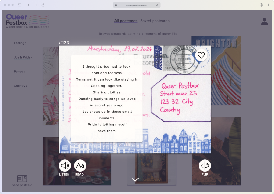
clicks
"READ"
to get the handwriting transcribed
scrolls down
to see reply card
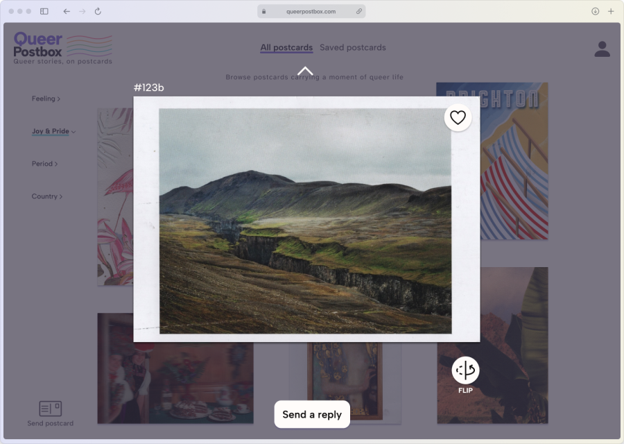
clicks heart
to save
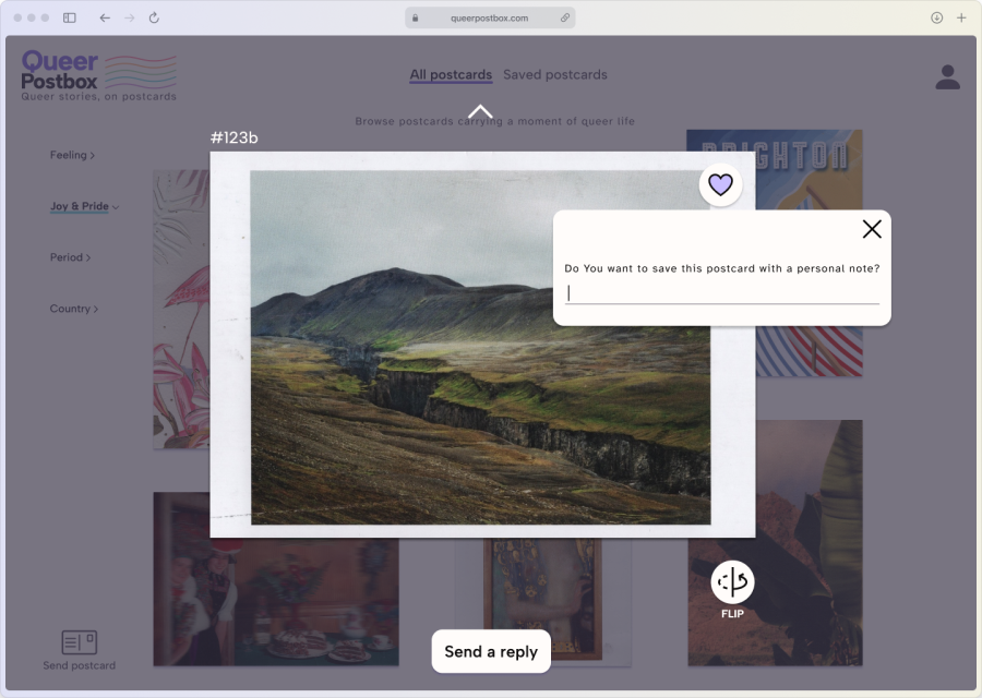
save with a personal note?

Swaps from
"All postcards"
to
"Saved postcards"
then clicks on
this card
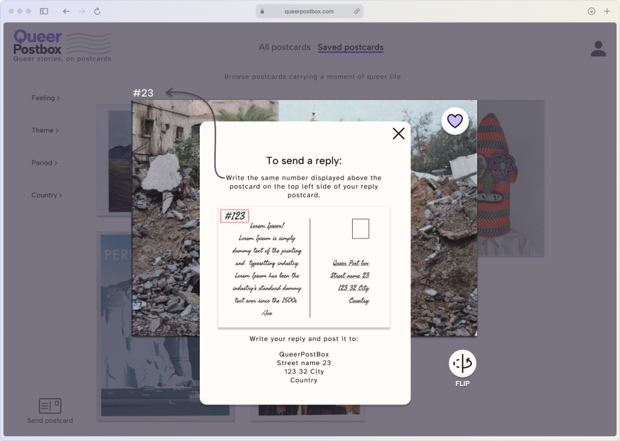
leaves the computer
to select and write
a postcard
returns
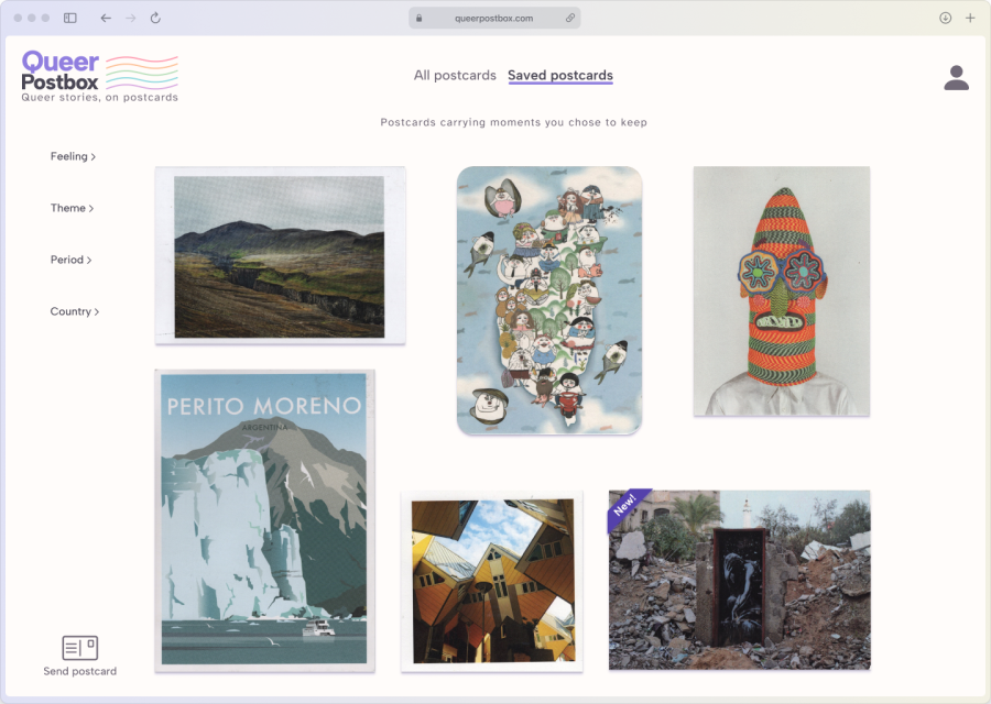
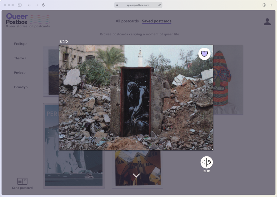
scrolls down and sees his card
flips it, just to make sure
The primary colour is purple since it is often used as an empowering colour within the queer community. For accent colours rainbow colours were picked, to bring in the pride to the site. All colours were kept pastelly to not draw attention from postcards.
Atkinson Hyperlegible
was chosen for body text since it is a font that is
discrete
, not drawing attention from the postcard, as well as designed for people with
vision impairment
, making it a perfect,
inclusive
font.
Albert Sans is used for shorter, attention-worthy text. It is clear and noticeable without feeling loud or decorative.
Most icons are from Iconify, with a few custom ones I created, including a letter and a rainbow. They were all chosen to be easily readable while remaining subtle, so they support the interface without drawing attention away from the postcards.
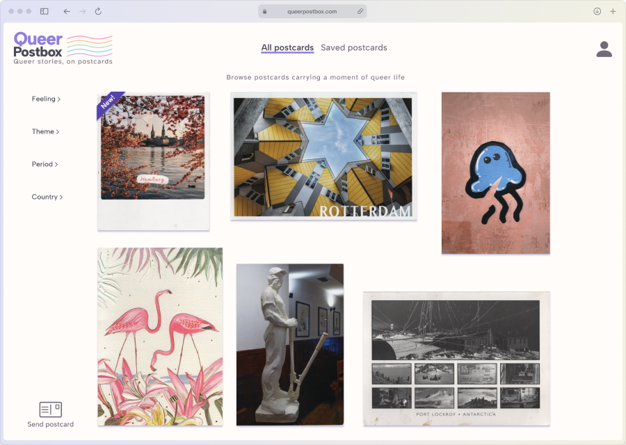
This GIF shows the user journey described earlier. The user enters the site, applies filters, and
spends time with a postcard and its reply. They favourite the reply they just viewed, drawn in by the
front of the postcard.
They then return to their saved postcards and choose one they have
had in mind for a while to respond to. They receive information on how to send a reply and do so.
In the final step, the user comes back to the site to see the postcard they sent.
Due to the time constraints of the project, user testing was limited to the visual direction of the landing page. Twelve participants were asked to choose between the current clean layout and an alternative with more visual guidance and clearer groupings. The responses were split between the two approaches. Based on the design principle respect the ritual, the decision was made to move forward with the more minimal version, as it was considered less distracting from the postcards themselves.
I learned how much you can uncover by really listening during interviews and asking the right follow-ups
- it's so fascinating!
I also got more comfortable in Figma, moving between layout, interaction,
and visuals more fluidly.
I know that this is just the first step of the project; the next
part won't unfold until the design has been tested. I'm very eager to do that and see this project come
to life.